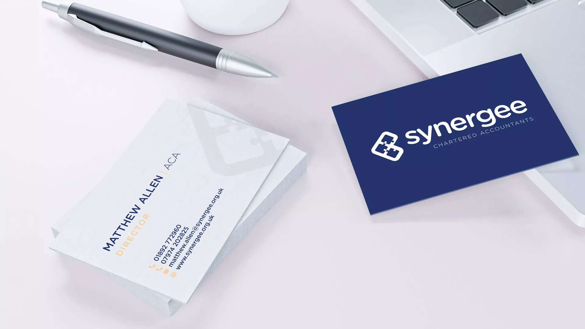
Synergee Accountants
case study
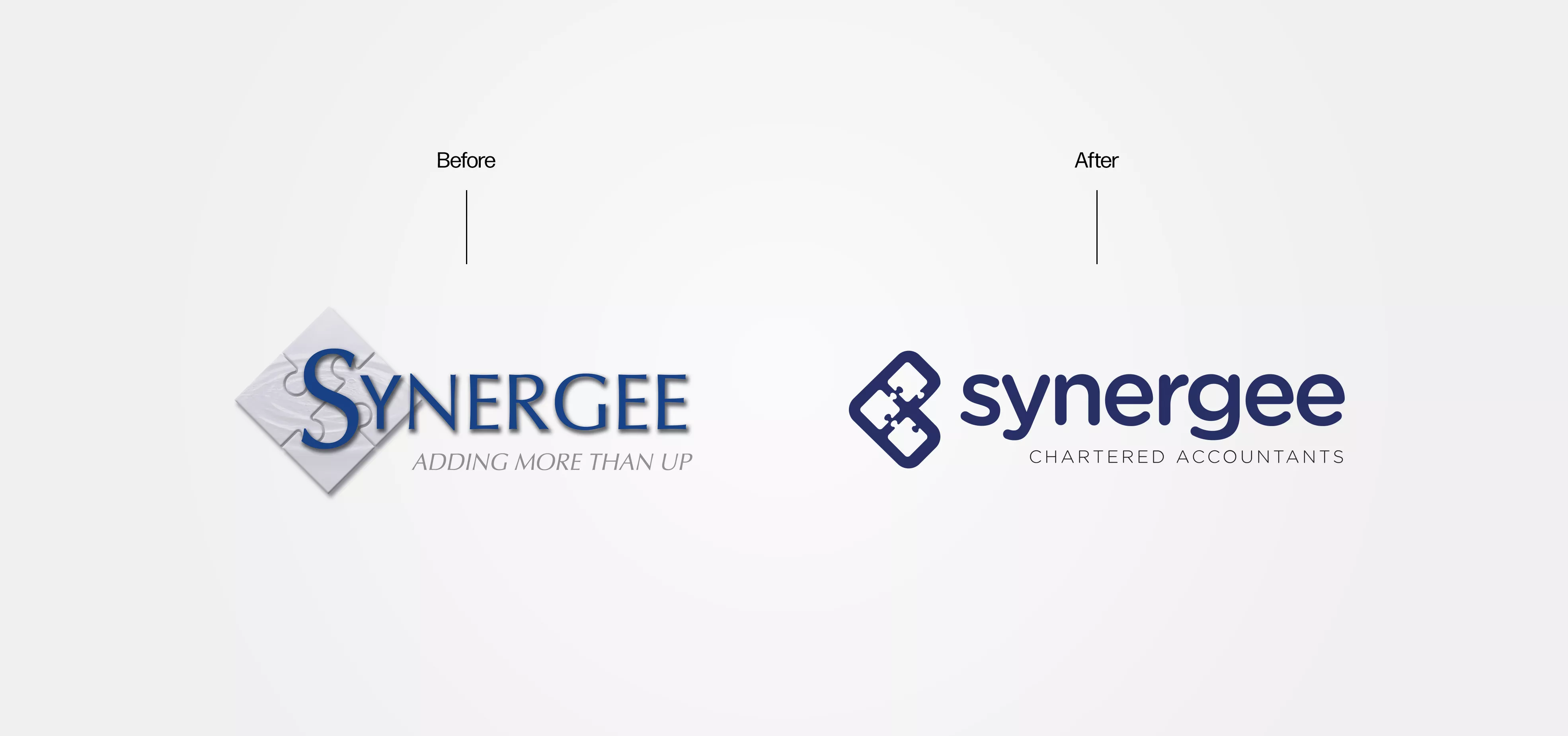
Synergee Accountants from Tunbridge Wells approached me to re-design and revamp their outdated branding.
As a modern, forward-thinking firm that embraces a cloud-based approach to accountancy, they wanted a logo that reflected this vision. They felt their existing logo no longer aligned with the business's current identity and was potentially holding them back from their goals.
Overview
As with any professional rebranding project, we took an approach that ensured the new logo and branding would still feel familiar to existing customers. Where possible it was important to retain elements from the old logo, giving it a fresh and revitalised look without making it feel completely unfamiliar.
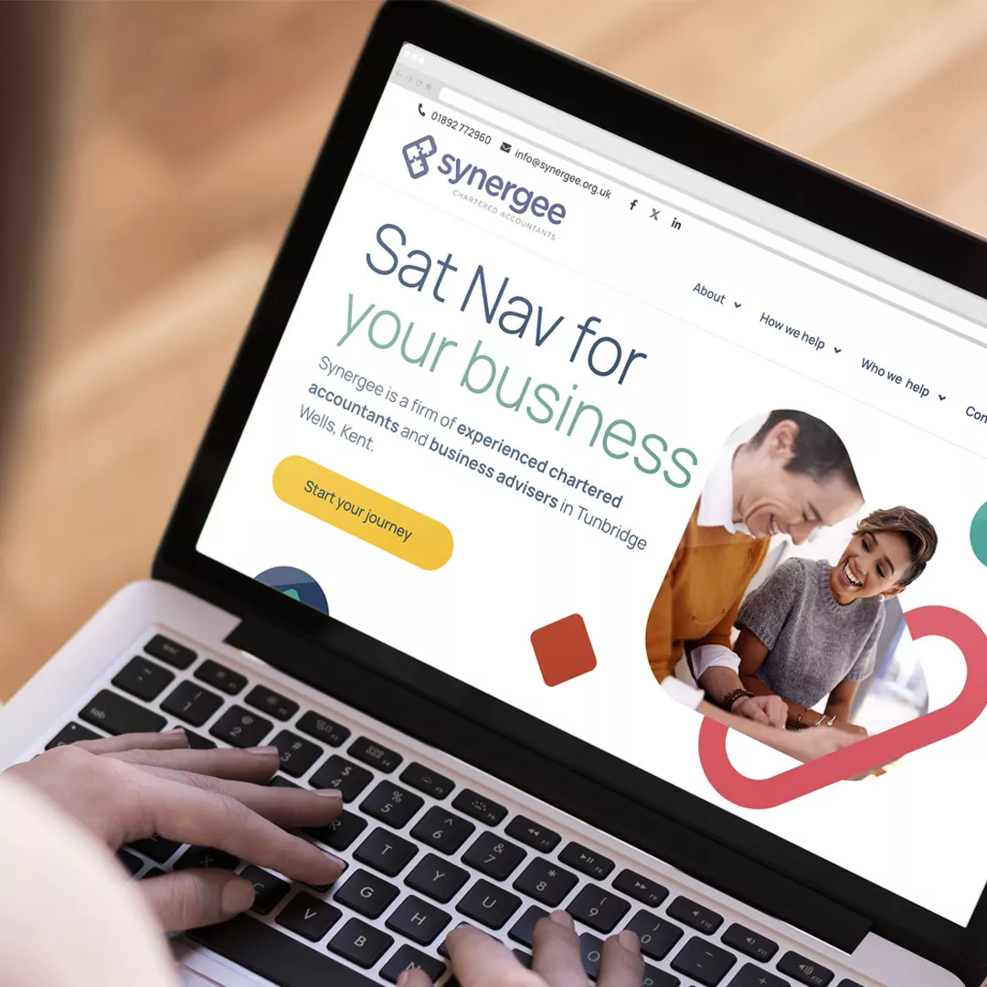
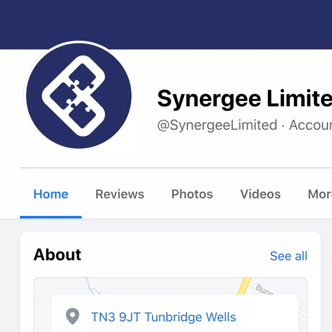
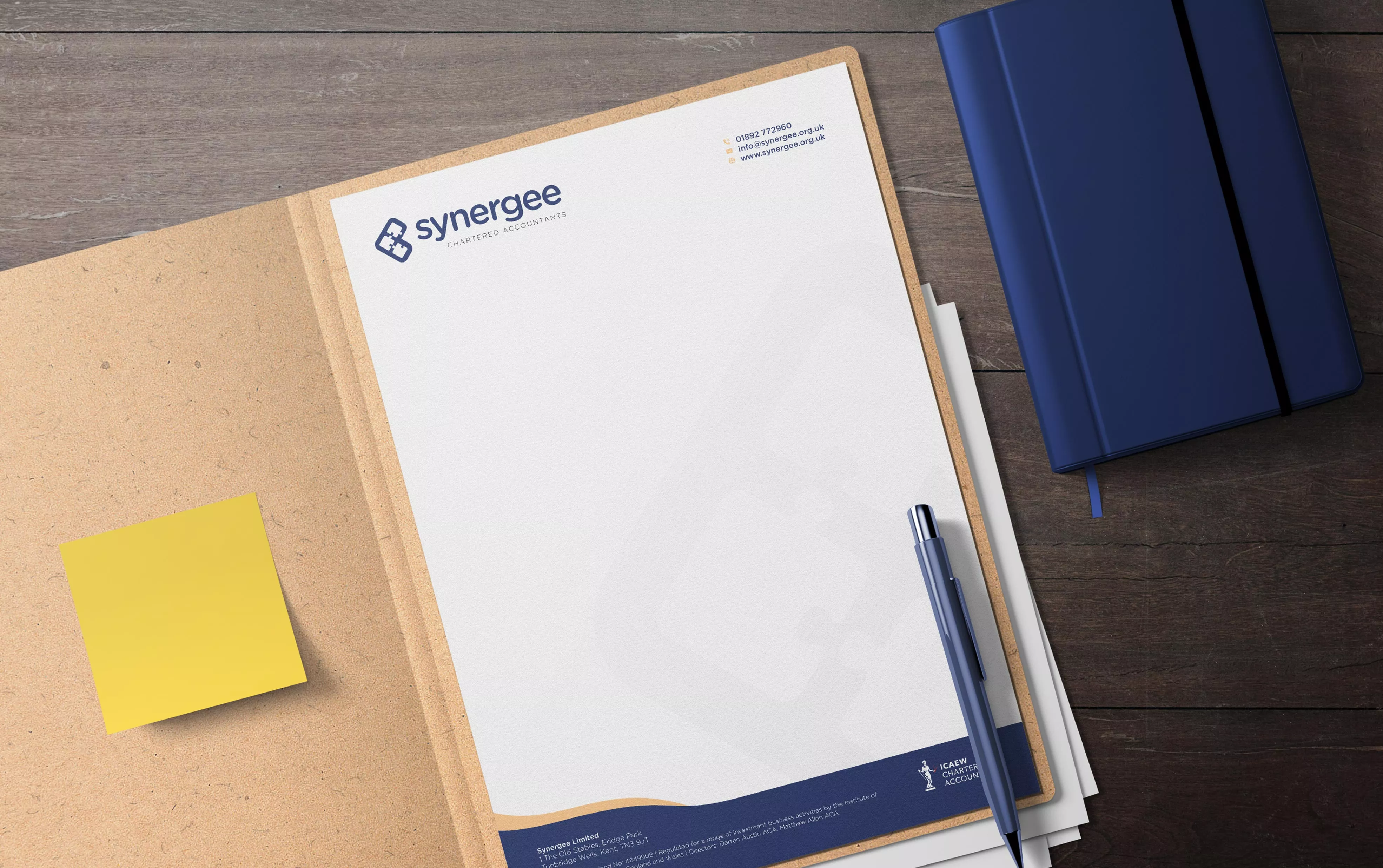
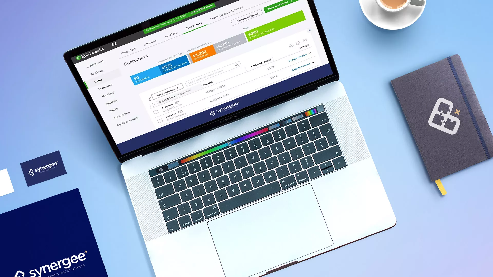
Being a predominantly online business, the logo also needed to perform well in digital formats while maintaining the versatility to be effectively used across various print materials.
The Solution
We introduced a fresh take on the classic Synergee puzzle pieces and paired it with a soft, approachable typeface to create a welcoming, modern logo with a vibe suited to a SaaS or tech savy firm.
A comprehensive branding pack was created, and we also supported the rollout of the new branding across all company marketing materials.