Walsh At George Farrer
case study
Creating the branding for this historic jeweller was all about honouring the past while developing a fresh identity that Walsh Bros could build upon in 2025. It’s not every day you’re tasked with re-establishing a brand originally created in 1876!
Working closely with Richard and Alexia, the challenge was to reinstate as much of the George Farrer look and feel as possible as a nod to the building’s heritage—while also crafting a distinct and prestigious brand that stands on its own, without overshadowing the existing Walsh Bros Jewellers up the road.
Overview
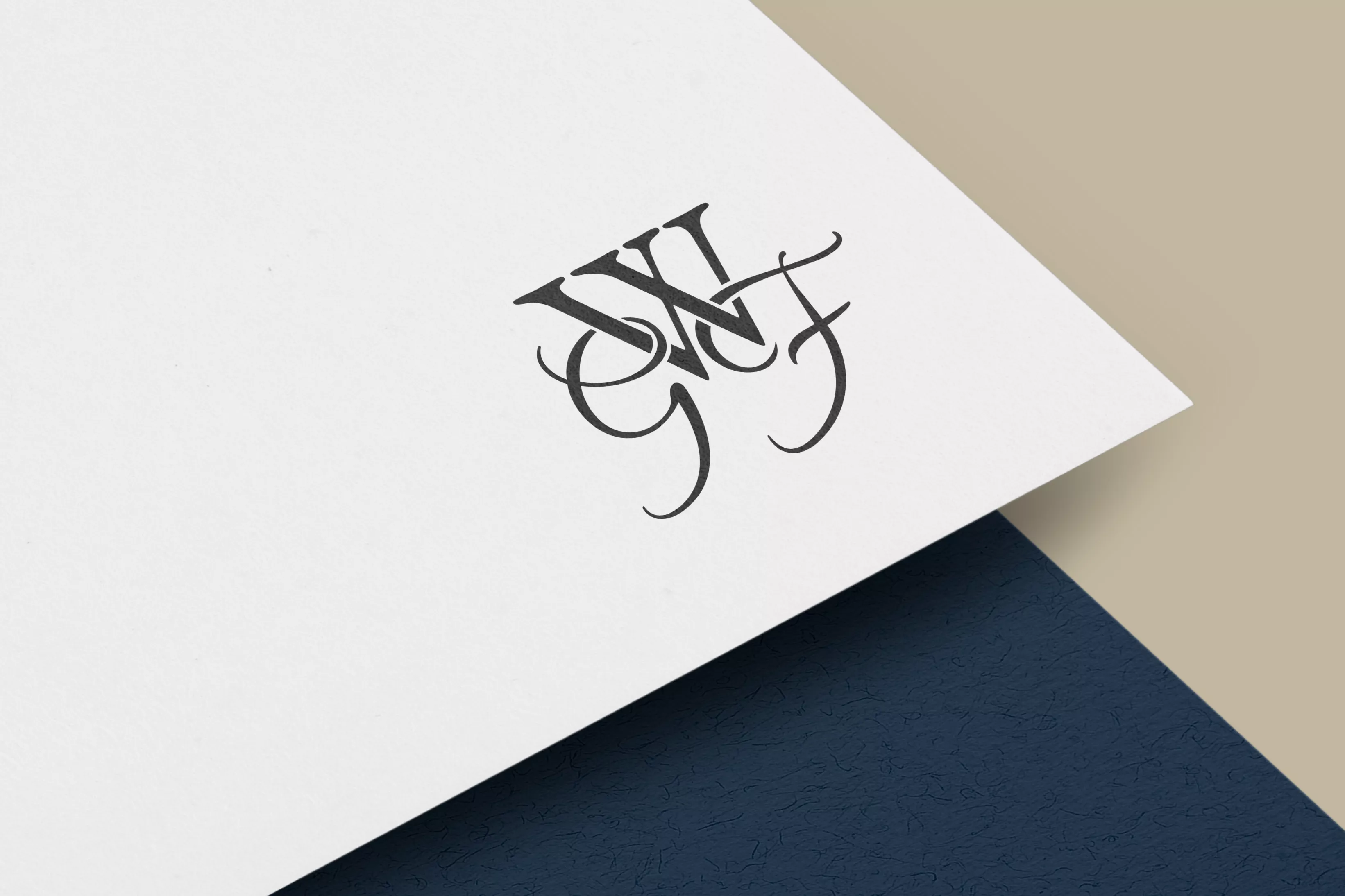
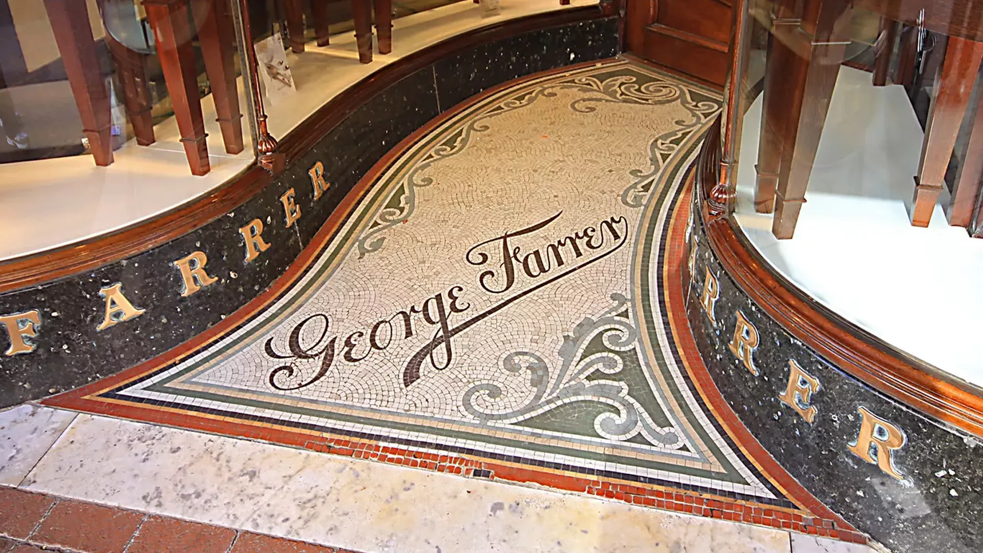
A key inspiration for the new logo came from the original mosaic entrance of the jewellers, a listed feature that proudly carries the George Farrer name. I carefully replicated the typography from this and merged it seamlessly within the new logo marque and initials element.
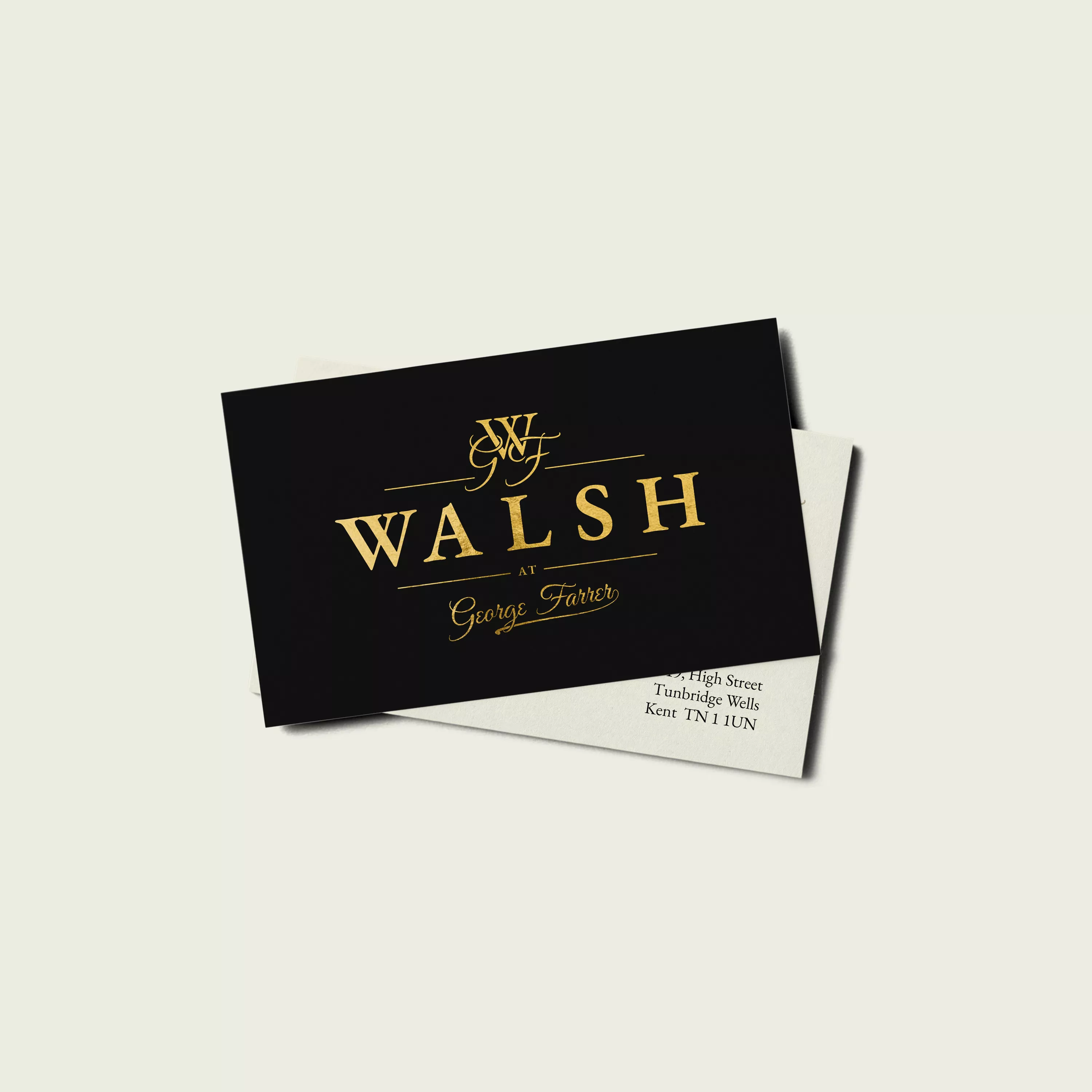
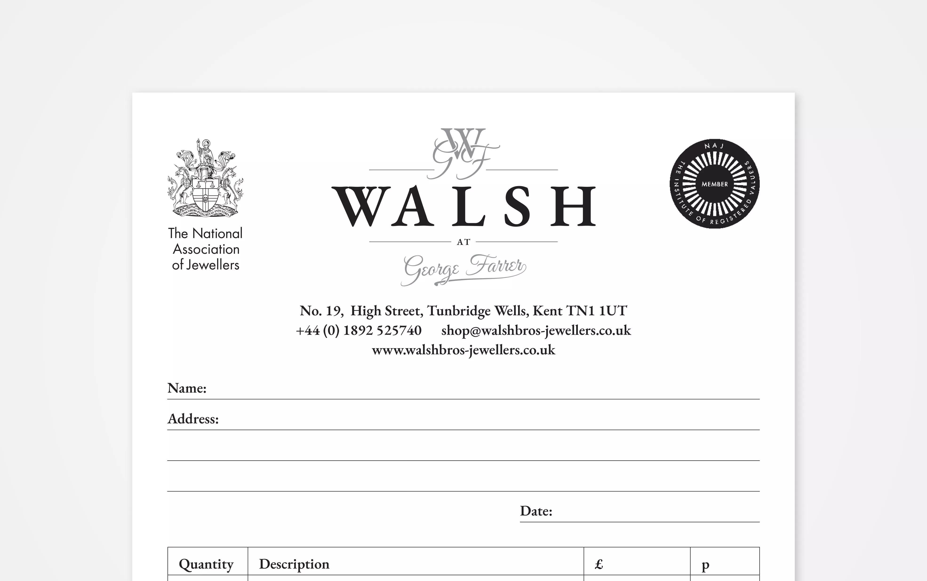
Beyond the new logo I assisted with design and supply of cards, letterheads, NCR invoice pads and of course the concept for the new signage that's since been brought to life by the one and only Steve Tabb of Tabb Signs. For this, we opted for a gold, gilded signage style which ensured everything remained authentic and true to the shop’s historic surroundings.
It's been a fab project to be a part of and though a very different style from the Thomas Mansfield Solicitors Rebrand, it's pretty cool to see my work now adorning two shopfronts on Tunbridge Wells High St.
Client Feedback: